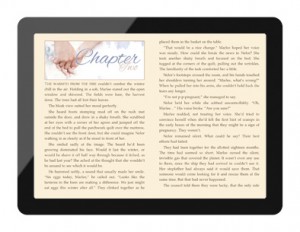
 This blog post isn’t about how to format your ebook (I’ll be writing one of those next week, now I’ve actually worked it out!), it’s about design. An ebook, like a print book, has several design elements besides the cover and the actual text, and how you handle these has a lot to do with the difference between a professional looking book, and an amateur.
Title page: every book has one of these. It follows the cover, and has the title and authors name. In its most simple form, most people just type and centre align these, and move on. But stop and take a look at a few traditionally published ebooks, and you’ll soon see the pretty fonts and publishers logos. Take the time to make this page look pretty, even if you have to use an image to do it.
Copyright page: again, at it’s most basic, this just needs the copyright symbol, your name, and the year. But again, there’s more you can add. A link to your webpage/blog, the designer of your cover if you have one, a small quote or note.
Table of contents: I’m still debating whether I’ll include one of these. (If you have an opinion on it, head on over to my Table of Contents post, and weigh in.) Obviously, these are essential for a reference book, as it not only gives an overview in your sample chapters of the topics covered, but helps a reader go straight to the section they’re after. In a novel, it’s simply a list of “chapter 1, chapter 2” and so on. It takes up room on your sample, offers no information to the reader, and really, do you ever use contents for navigation in a novel? I checked several traditionally published books, and only about 50% included one, so they’re definitely not a necessity. But if you do make one, what can you do to make it stand out?
Dedication: if you include one, keep it short, or put it at the end. You don’t want to take up pages of precious room in your sample with information the reader may skip over.
Chapter headings: just about all the self published books I looked at had simple, centred, headings for chapter titles. Some did really badly though, and had left justified, normal text for headings. The worst didn’t include page breaks, so that one chapter started right under the last, some with the first chapter starting half way down the dedication page! True, after the first one or two, most people ignore chapter titles (or I do anyway, I don’t even see them after a while), but it’s still worth doing something to pretty them up. Add a little colour, use italics, or for some real pizzaz, use an image.
Scene breaks: some books I saw used swirls or other graphics for scene breaks, and I really wanted to do the same, unfortunately, when I tried this, it only looked good in the white view on my iPad. If you choose to set your iPad to the sepia tone, or even worse, the white text on black, they look very unprofessional. So reluctantly, I’m sticking with the traditional five asterisks.
How do you jazz up your ebook design? What design features have you liked in ebooks you’ve read, and what have you hated?

So if you want to put nice section breaks in you need to choose a black on TRANSPARENT image and save it as a PNG file which will work as it’s supposed to both in ePub and Kindle.
I’d love to know if this works, and if so, how? I tried .png files with a transparent background, and they weren’t transparent when converted to .mobi files. Gif files retained their transparency, but were horribly pixelated, and had untidy white edges that looked awful on the black.